Healthcare design case study · 5 chapters
2025–present
ProActive
The companion app for a self-inflating vest that eases sensory overload

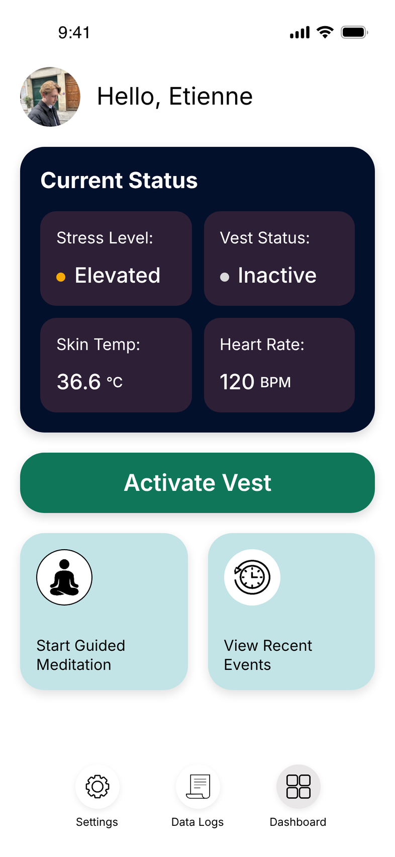
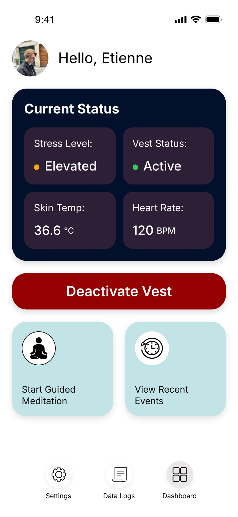
Plate I · The ProActive vest, and the app's dashboard in both states. I kept one control in the same place in both states.
Overview
ProActive is a reusable, self-inflating vest for people with autism and sensory sensitivities. I designed the app that pairs with it, end to end: I turned the research team's findings into features, then designed the flows, the screens and the colour system, so wearers and caregivers can see what the vest senses, control it, and learn from each episode.
How the vest works
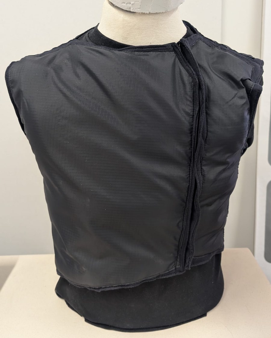
The ProActive prototype
Sensory overload happens in everyday places.
Sound, light, crowds and touch can all trigger it.
01Sensors in the vest detect rising stress.
02The vest inflates to apply firm, even pressure.
03It deflates once the wearer is calm.
2026 prototype, in development.
Recognition
CA$30,000
Total funding won through awards
£5,000
From the James Dyson Award
James Dyson Award
Canadian national winner, 2026
ACIDO
People's Choice Award, 2025
Cboe Canada
Award for Disruptive Design, 2025
RBC CEAD Seed Fund
Runner-up, 2026
Outcome
The vest doesn't work without the app: it's how wearers see what the vest senses and turn it on and off. The app is pitched as part of the product, and my screens are shown alongside the vest at startup showcases.
Contents
Select a chapter to open or close it
I.Problem and Goalsp. 1
I turned the startup's research into the app's brief. Because the app and the vest are being built at the same time, I keep reiterating the design as the hardware changes and the research team learns more. With this user base, I made accessibility my first priority throughout.
Goals
01A visible, accessible emergency help screen
02A calming colour scheme that still passes contrast checks
03Many functions, with navigation that stays clear
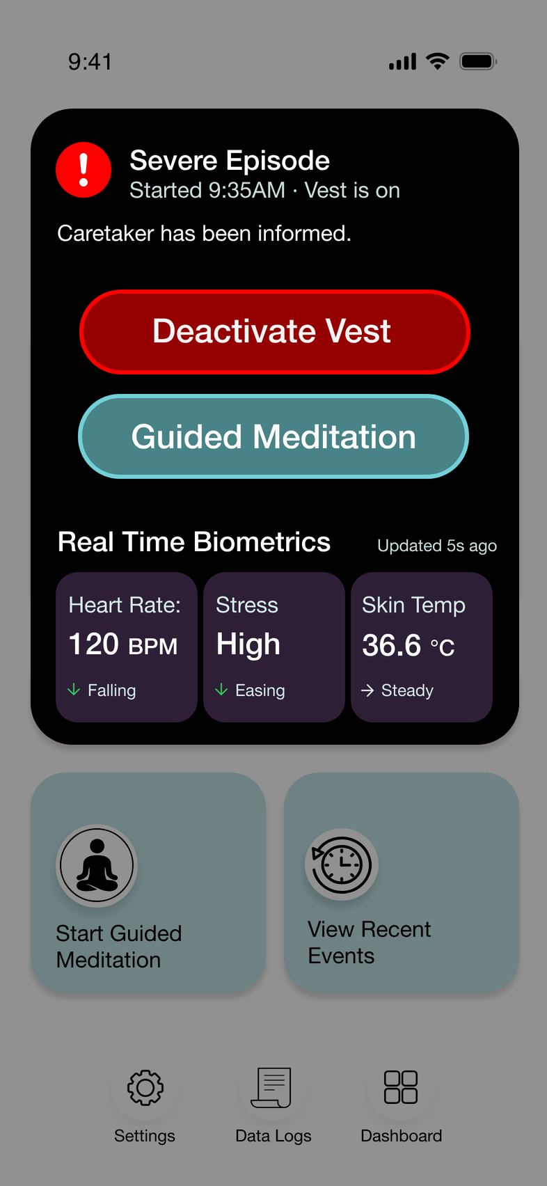
Fig. 1 · Severe episode: the two actions that matter come first.
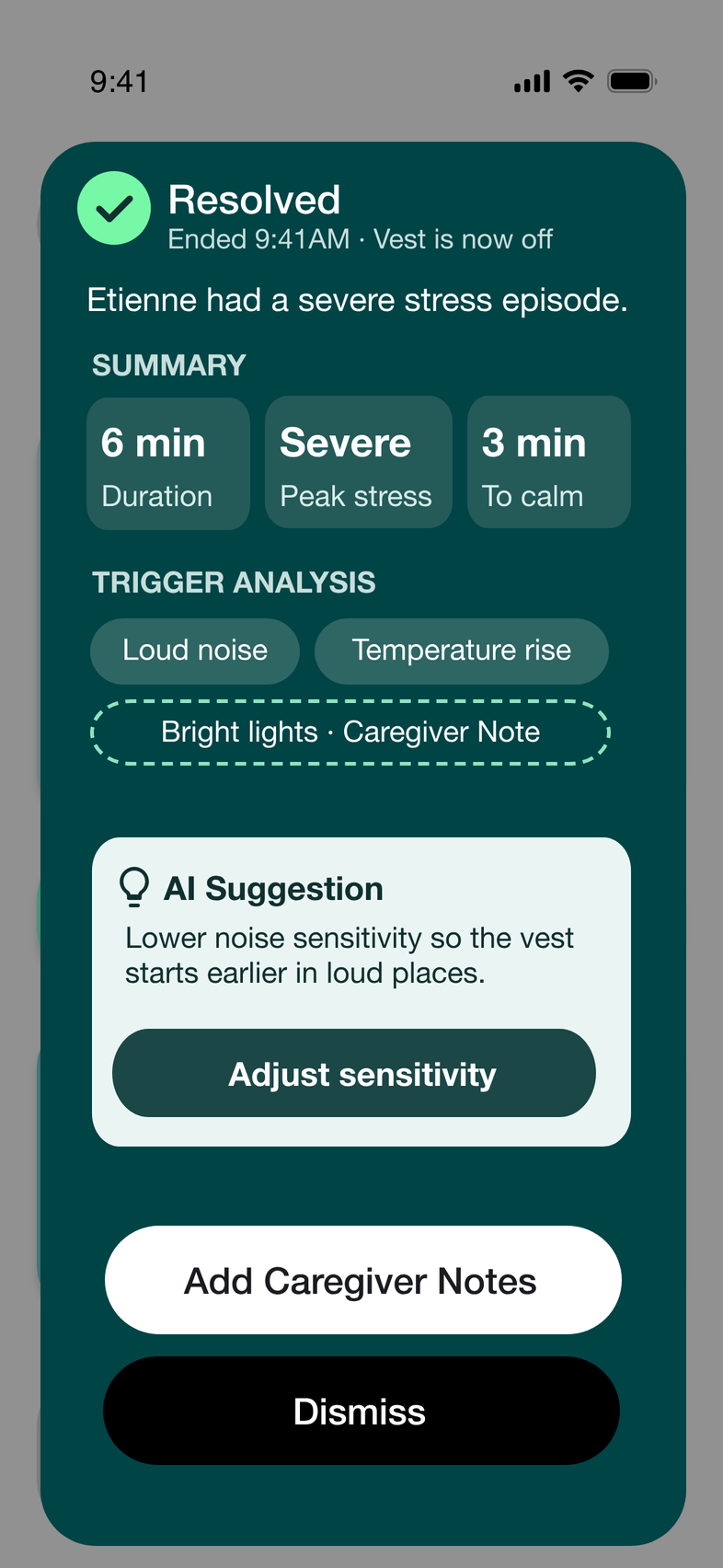
Fig. 2 · Resolved: a plain summary of what happened.
Two buttons, nothing else
I cut this screen down to two actions. In the moment, the wearer only needs to stop the vest or start calming down; everything else waits until the episode is over.
II.
Research
p. 2
The research team ran user interviews and A/B tests. My role was to turn what they found into design decisions.
What they found → what I designed
01Wearers and caregivers couldn't tell what caused their stress → Trigger analysis that names the likely cause of each episode
02Wearers needed guidance when stress peaked → Guided meditation offered at the moment stress rises
03Wearers wanted privacy from caregivers, as some episodes were personal → Caregiver notes kept alongside a private journal
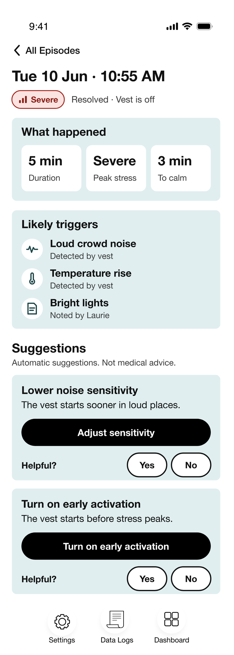
Fig. 3 · Episode detail: what happened, likely triggers and suggestions.
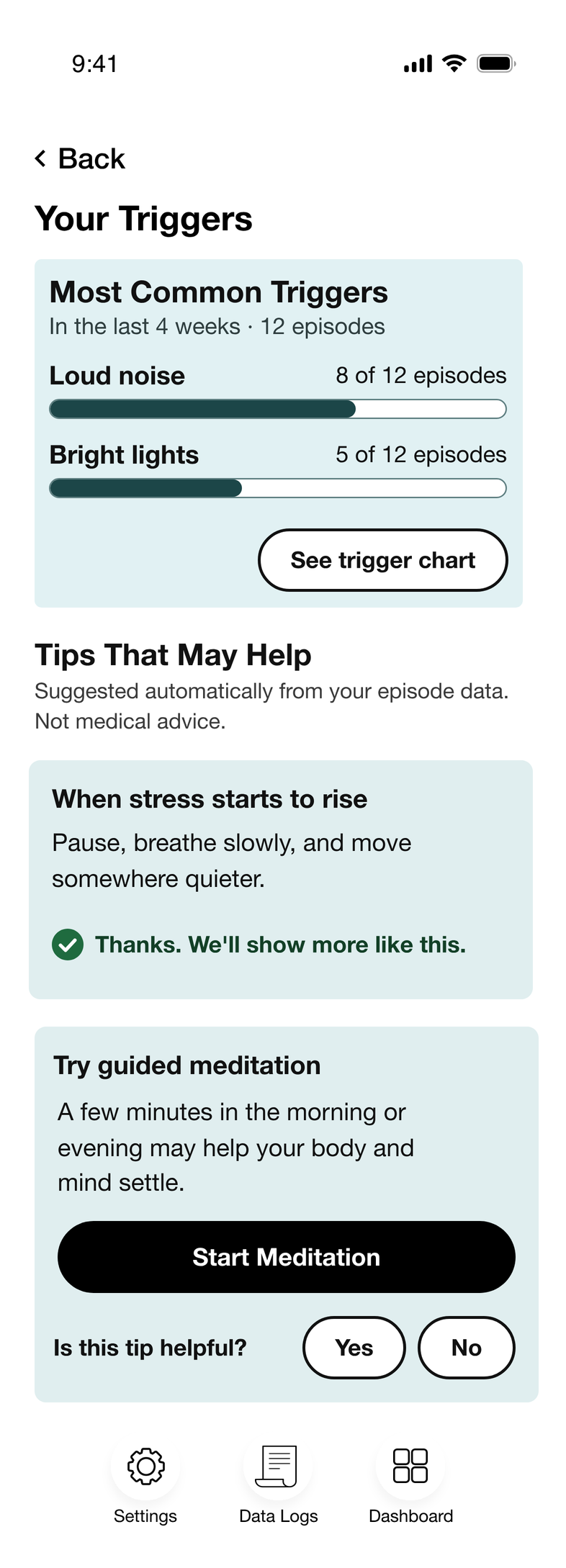
Fig. 4 · Triggers: patterns across weeks, with tips that may help.
From data to next steps
I made every insight end in something the wearer can do, such as adjusting the vest's sensitivity, with a quick “Helpful?” check.
III.The Appp. 3
I designed the app around three jobs: show what the vest is sensing, give the wearer control, and help wearers and caregivers learn from past episodes.
Fig. 5 · Dashboard: live status first, then one large vest control.
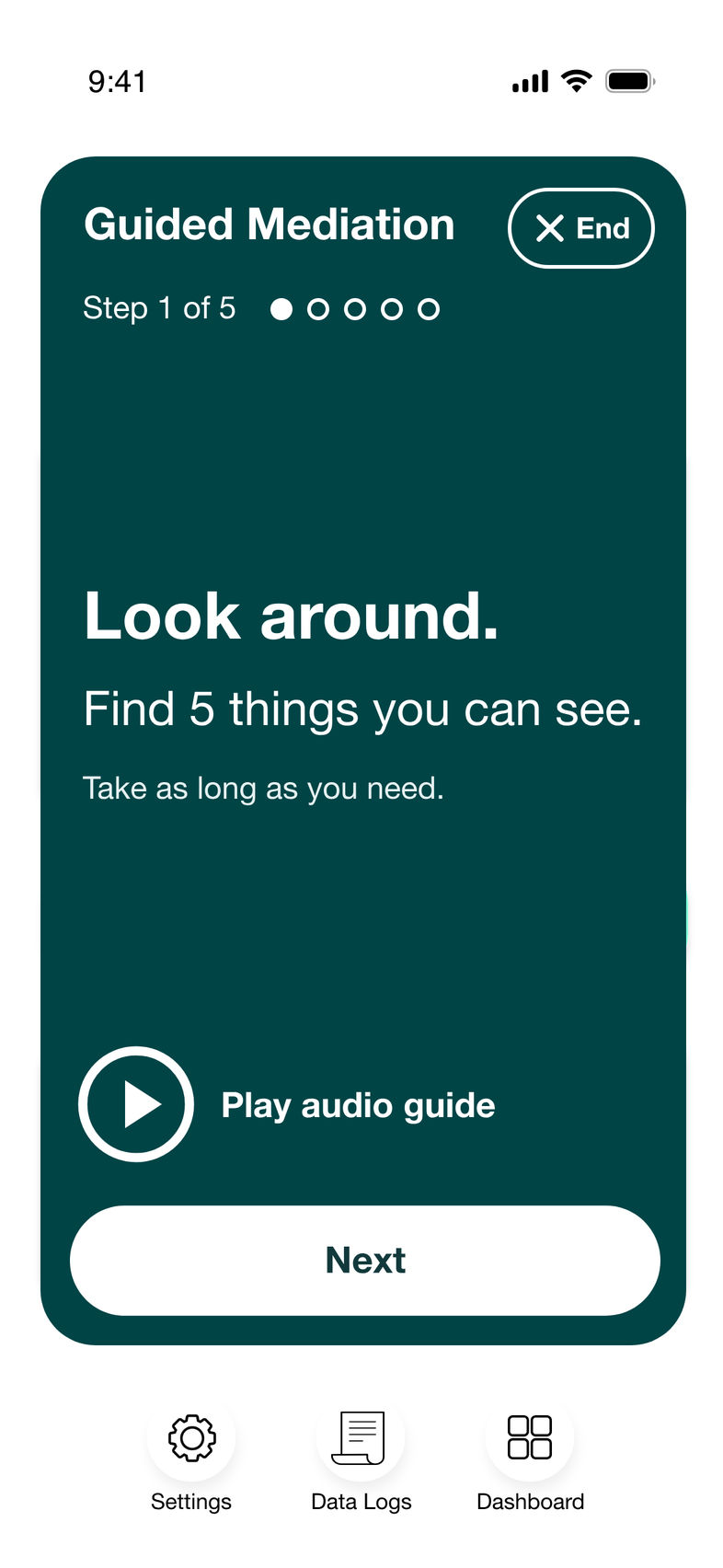
Fig. 6 · Guided meditation: one instruction at a time.
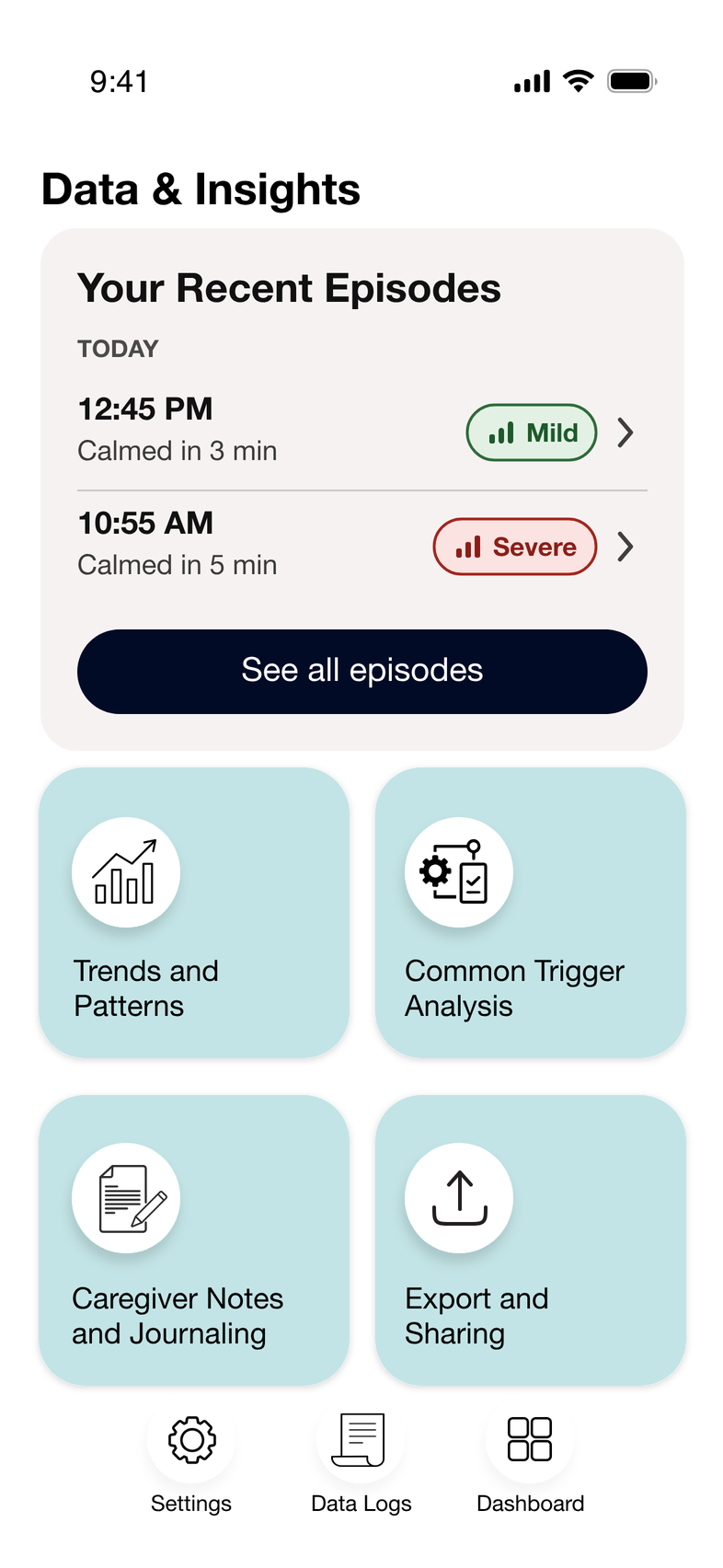
Fig. 7 · Data and insights: recent episodes, rated by severity.
“A colour scheme where one is able to alert the user without increasing stress”
Status navy
#02102b
#02102b
Activate green
#107659
#107659
Deactivate red
#950000
#950000
Calm teal
#004446
#004446
Tile blue
#c2e4e6
#c2e4e6
Fig. 8 · The app's palette
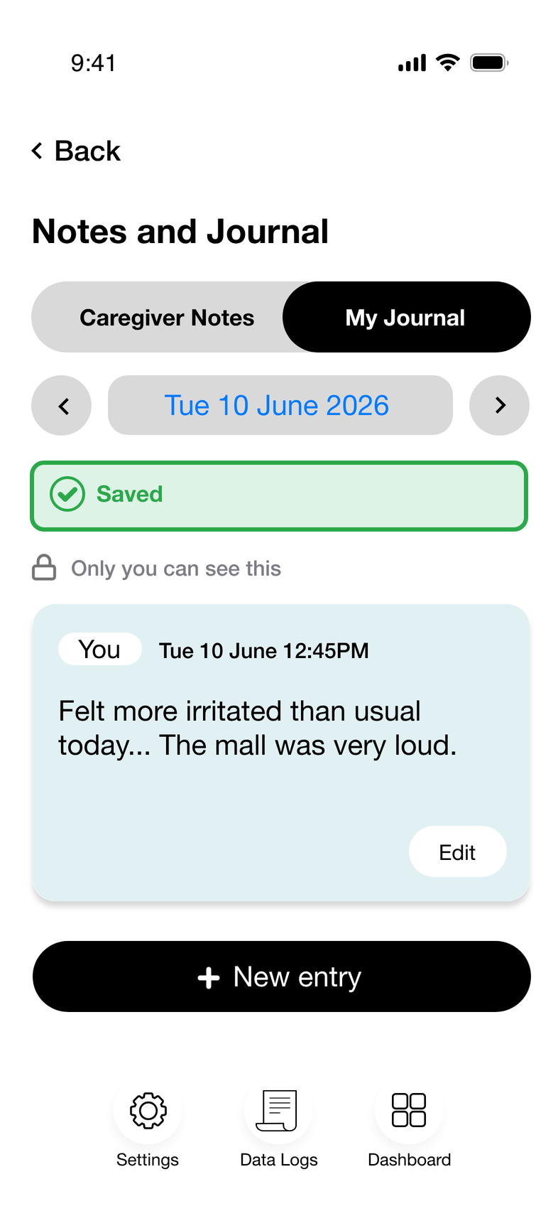
Fig. 9 · Journal: private by default.
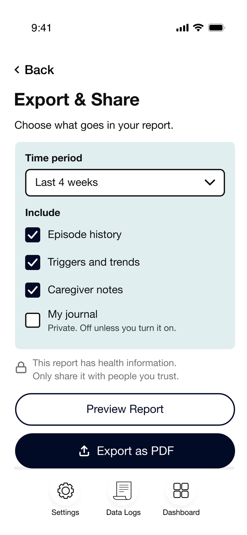
Fig. 10 · Export: the wearer chooses what a report includes.
Private by default
I made journal entries private by default. They're marked “Only you can see this”, and stay out of shared reports unless the wearer turns them on.
IV.Iteration Examplep. 4
In my first version of the data log, people had to open each section in turn to understand one episode. I realised the order of information was the problem, and rebuilt it as a shorter, cleaner flow.
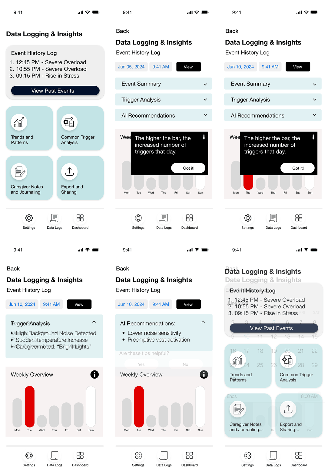
Before
10 screens
A date picker, three dropdowns and tooltips.
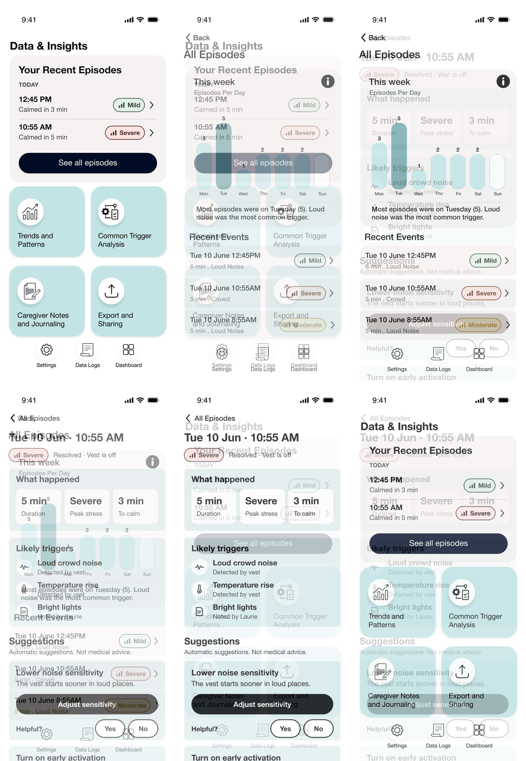
After
3 screens
Recent episodes, the week, then one episode on one page.
V.
Reflection
p. 5
This was my first time working with a startup on an ongoing basis. As a freelancer I usually run the research myself; here I took input from the research team. The team's capabilities kept changing, so I recreated the app many times to match new goals. Throughout this process I learned more about designing accessible screens, especially following the Web Content Accessibility Guidelines (WCAG).
Next project
When is Redesign Necessary?